24Kare

Objective:

We partnered with 24 Kare to elevate their presence as a trusted NDIS provider by creating a cohesive brand identity, personalised print suite, and a warm, participant-focused website built for clarity and care.
24Kare logo featuring a stylised 24 inside a circular shape with a supporting hand icon on a solid blue background

Industry

Project Duration

3 Weeks

Share

01

We developed a gentle, welcoming identity system inspired by 24 Kare’s calm colour palette and people-centred philosophy. The branding reflects safety, dignity, and support — blending soft tones, compassionate visuals, and clean design to communicate trust and genuine care for every participant.

Identity Design

02
To support community engagement and referral pathways, we designed brochures, flyers, and visiting cards that mirror the brand’s warmth and accessibility. The layouts use friendly imagery, simple language, and clear service explanations to help families instantly understand how 24 Kare can support their needs.

Print Collaterals

Business Card Aurora design featuring navy and yellow cards with logo, contact details, QR code and modern professional layout
03
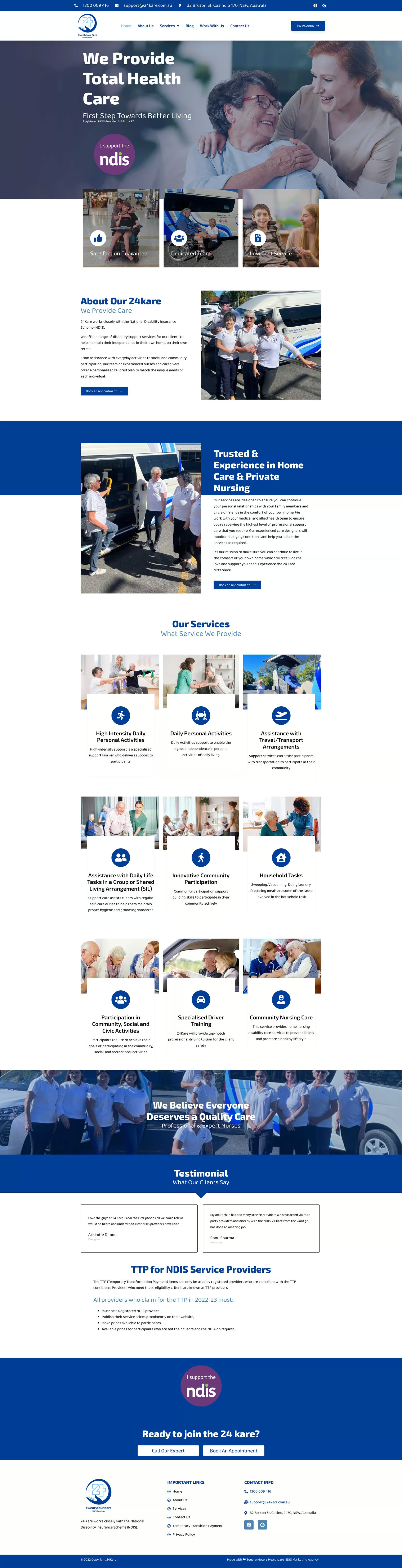
We created a modern, easy-to-navigate website that speaks directly to NDIS participants and families. With clear service pages, supportive messaging, and strong calls-to-action, the website delivers comfort, clarity, and connection — turning visitors into confident enquiries while reflecting 24 Kare’s commitment to personalised care.

Website Design

Book a Free Consultation

Book a Free Consultation

[enquiry_iframe]