01
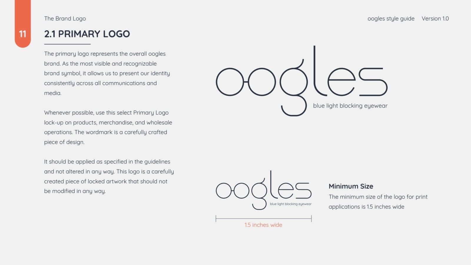
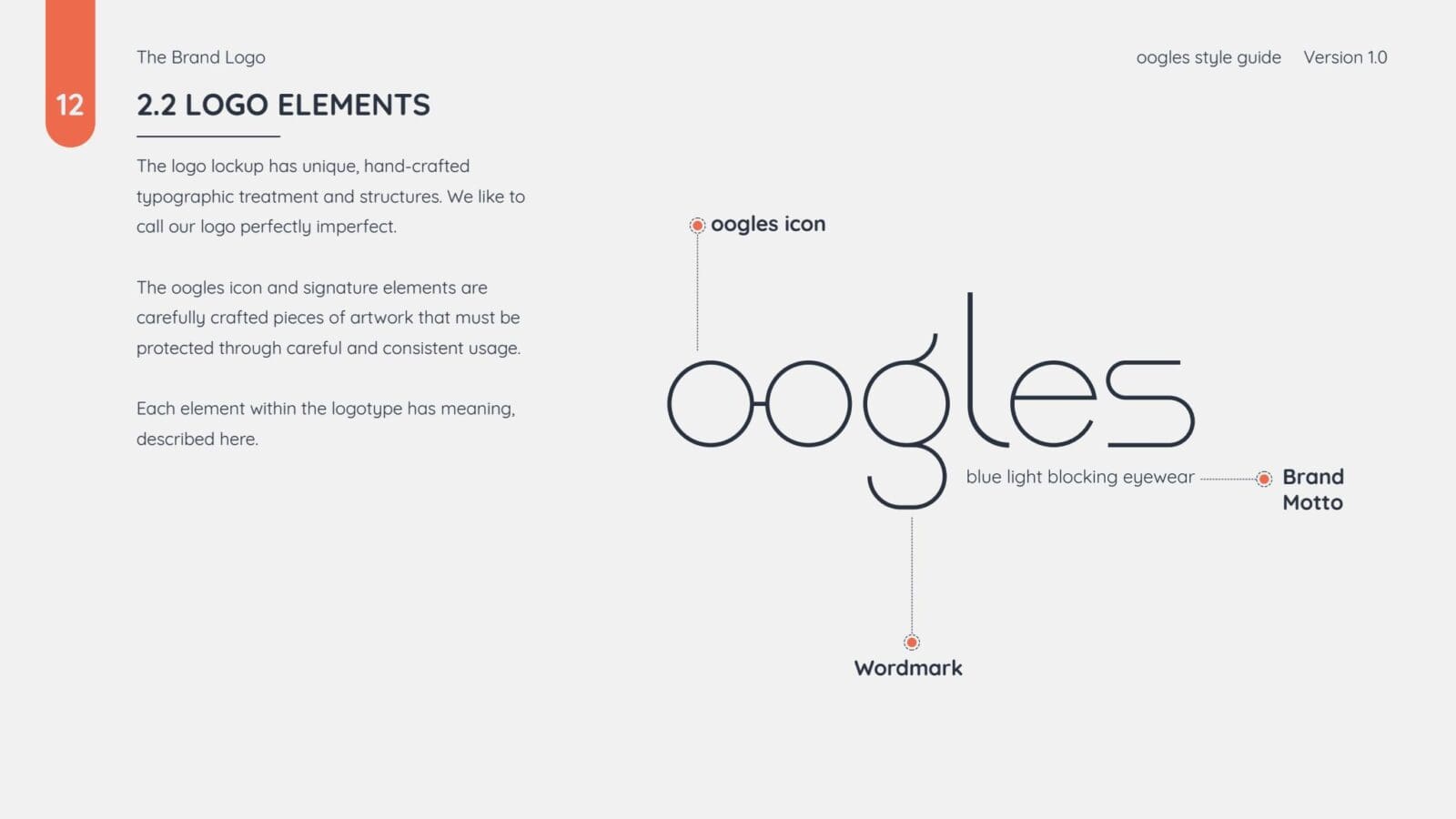
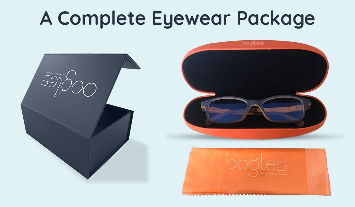
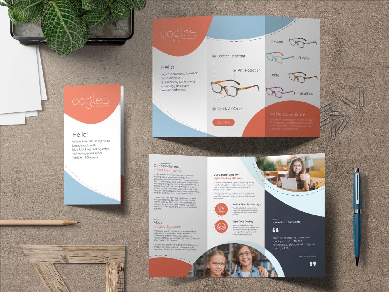
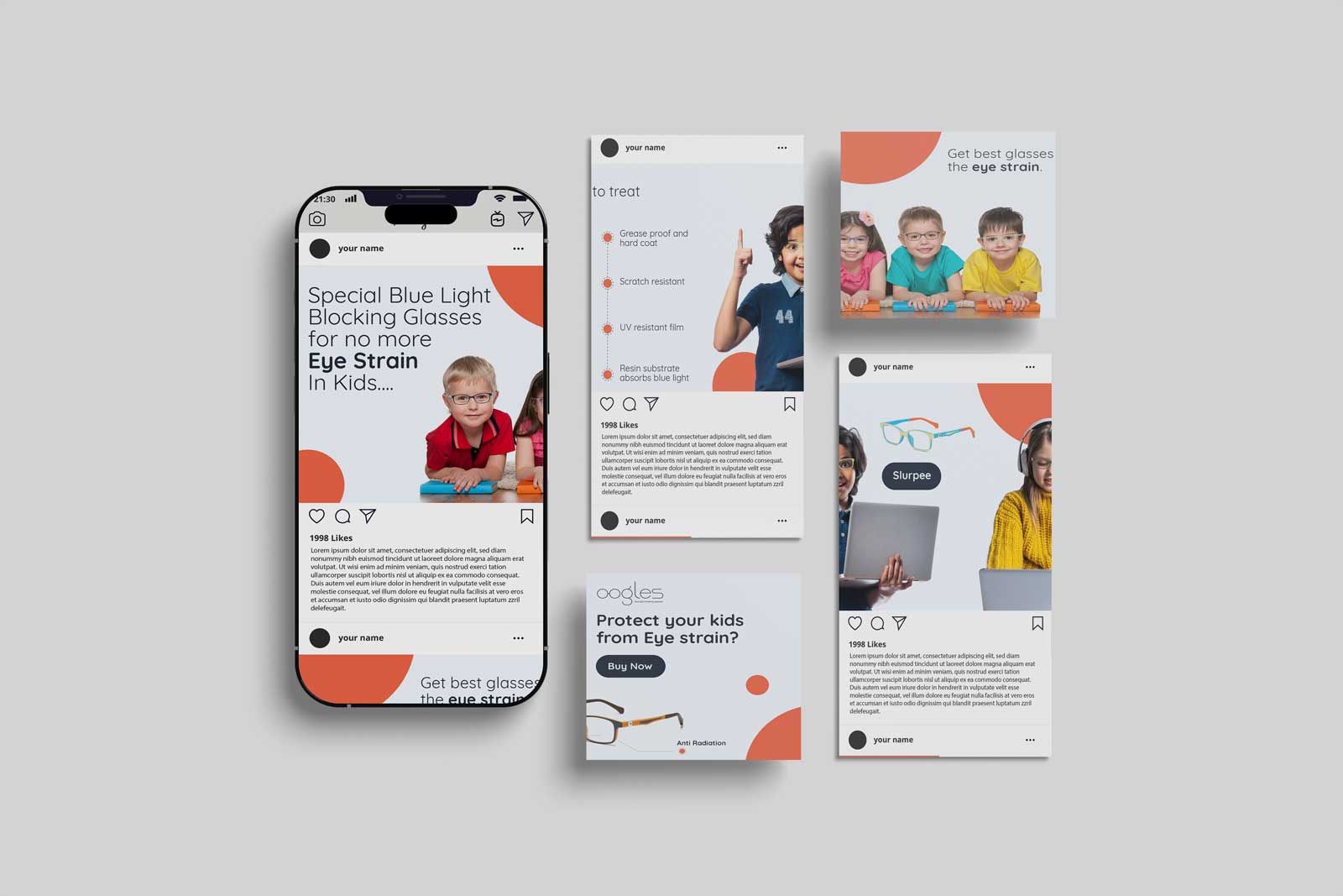
We developed a fresh and contemporary colour palette using Gunmetal, Burnt Sienna, Light Cyan, and soft blues. These tones create a clean, eye-friendly aesthetic that aligns with the purpose of blue-light eyewear. Typography was selected to complement the logo’s rounded forms, creating a cohesive visual system that feels modern, trustworthy, and child-friendly.
The Logo Idea
02
The color palette uses earthy tones and vibrant orange to reflect warmth and passion, while modern sans-serif typography ensures simplicity, readability, and a welcoming feel.
Color Pallette & Typography
03
Oogles’ print ecosystem includes packaging, shopping bags, tags, and branded stationery. Each item uses the primary palette and clean typography to maintain consistency. The minimalist design and colour balance strengthen shelf appeal while keeping the brand instantly recognisable and premium across all physical customer touchpoints.
Print Collaterals
04
The Oogles website was designed to be bright, intuitive, and family-friendly. Using soft colours, playful shapes, and lifestyle imagery, we created an online store that communicates comfort and care. The product pages were optimised for clarity, while the layout ensures easy navigation for parents and shoppers seeking blue-light eyewear.
Website Design
05
Our social media design system uses bold visuals, kid-centric photography, and educational content layouts to highlight eye-care benefits. Each template reflects the brand’s colours and personality, ensuring consistent storytelling across Instagram and Meta platforms. The result is a vibrant, engaging presence that drives curiosity, trust, and product interest.
Social Media Design