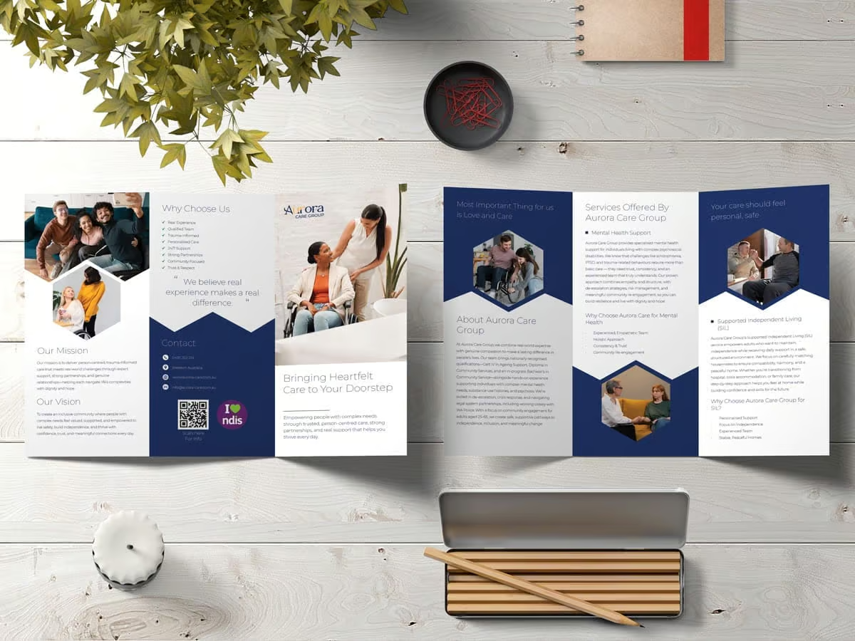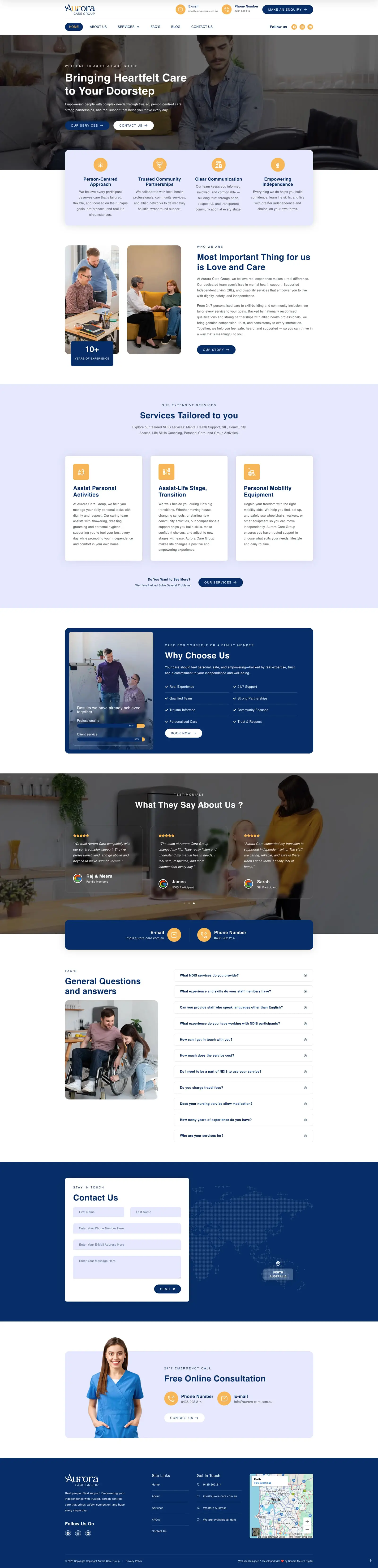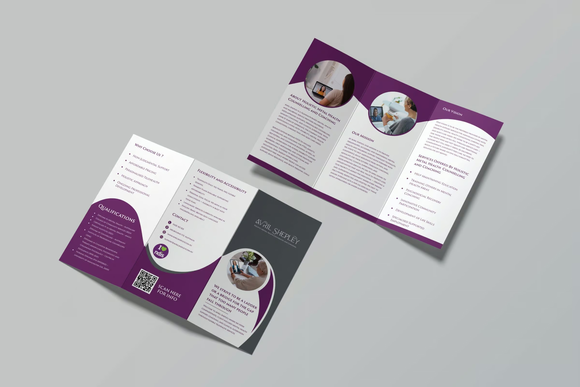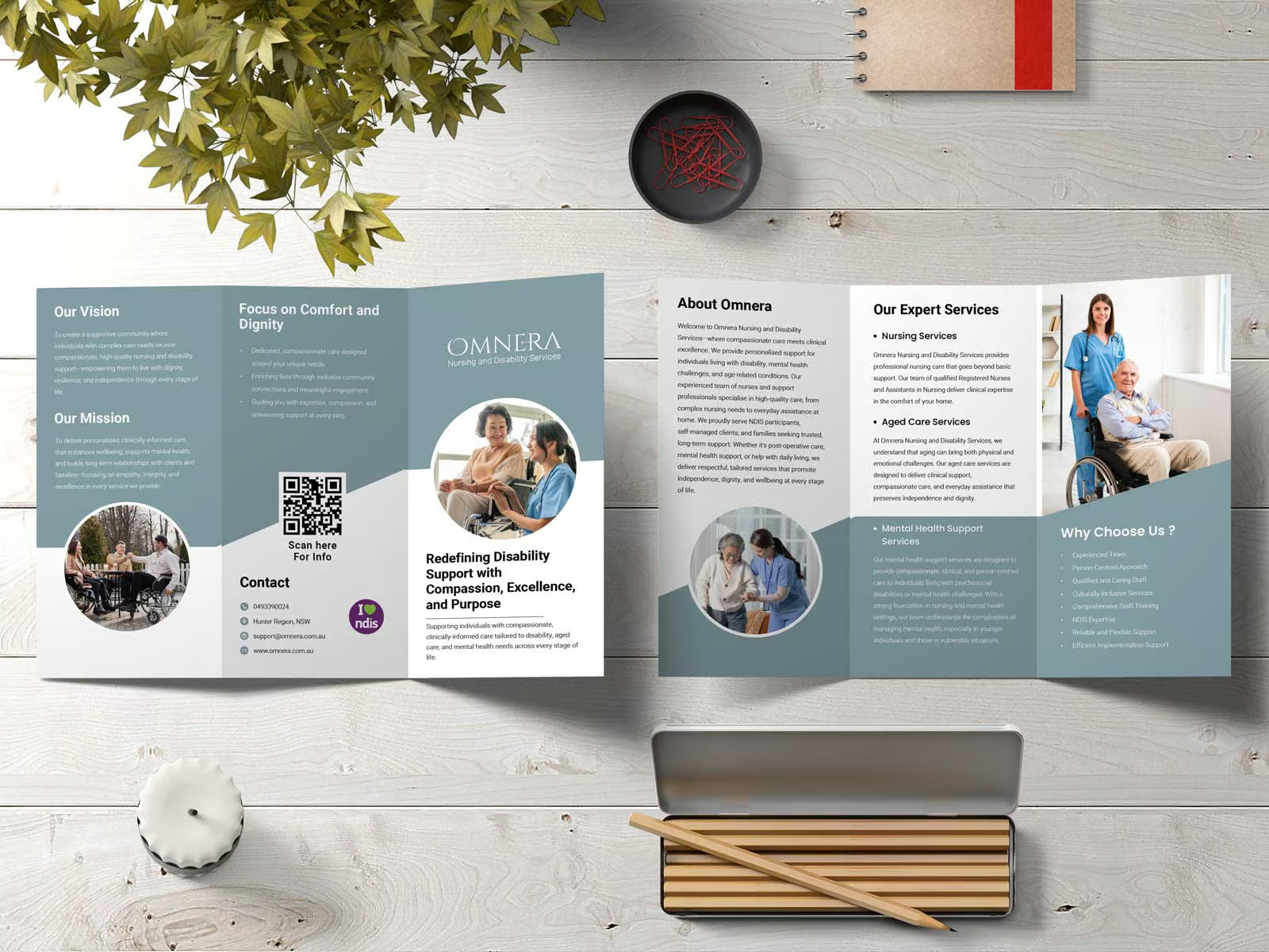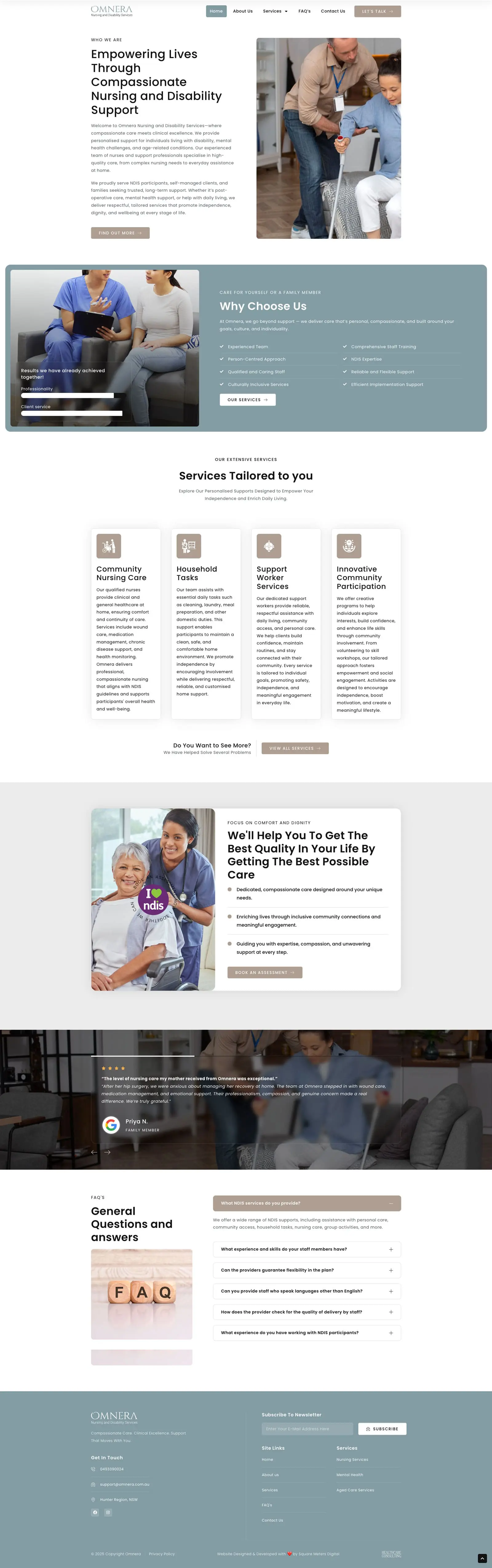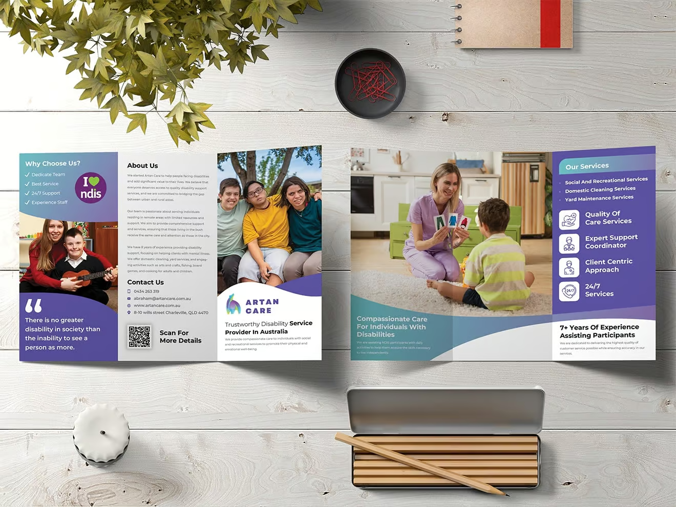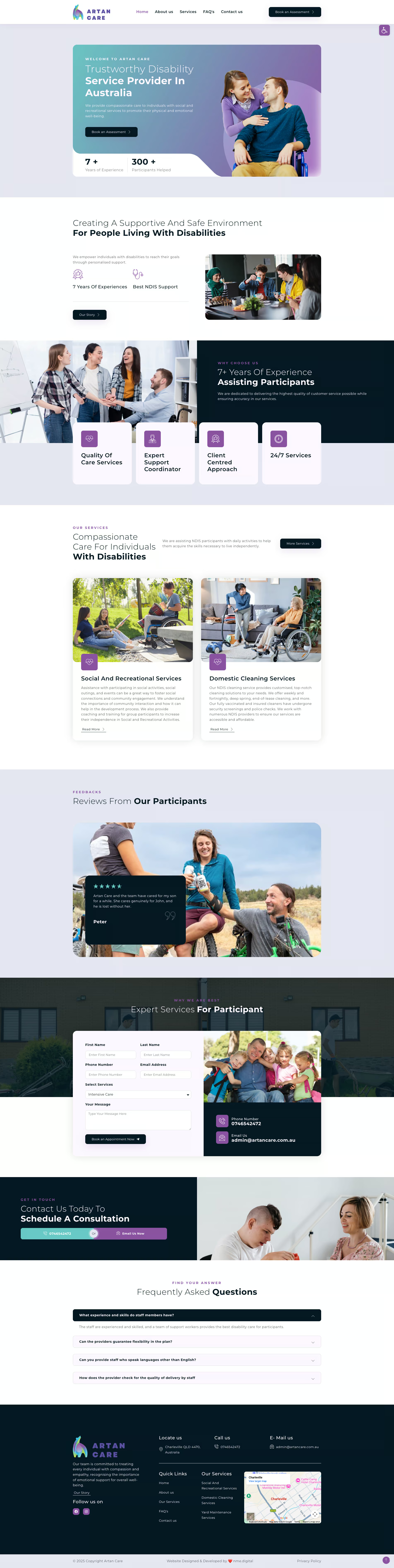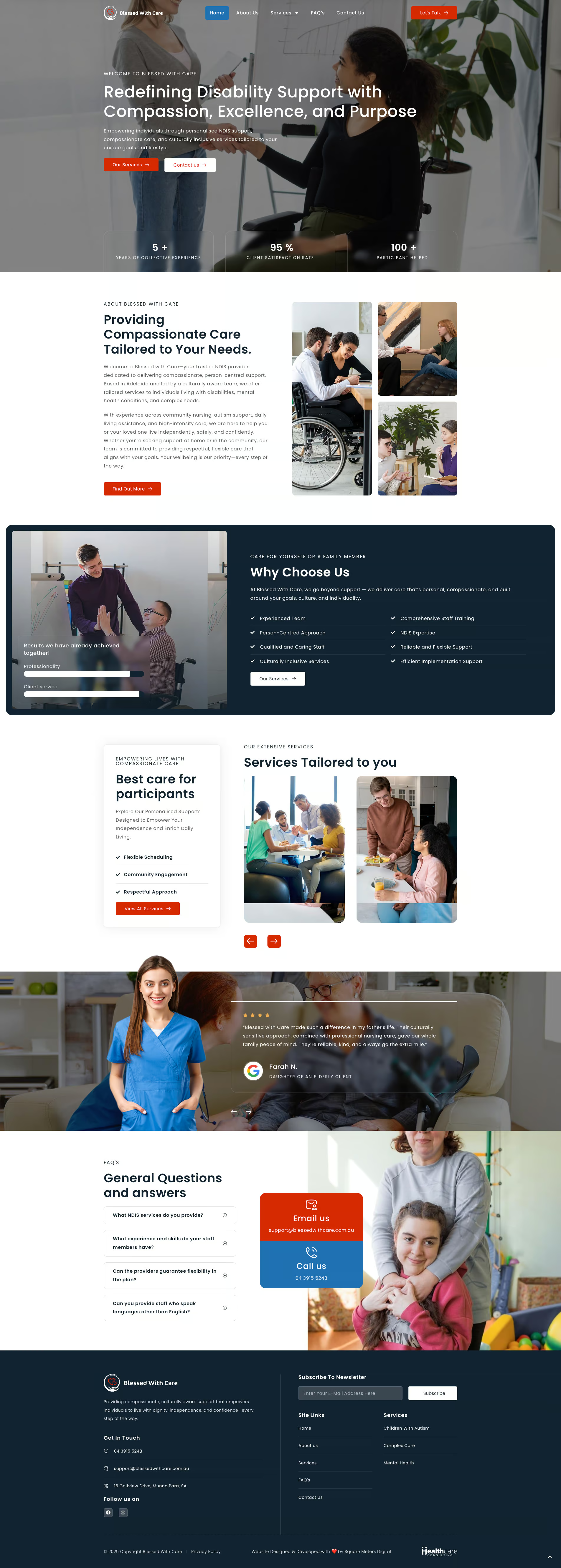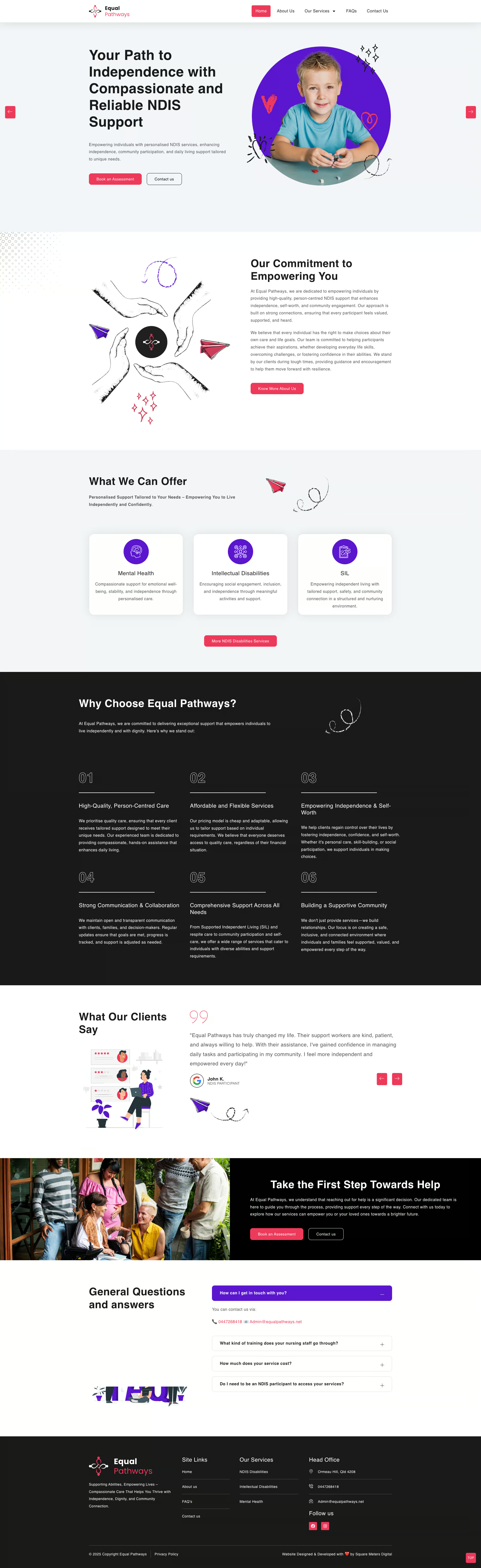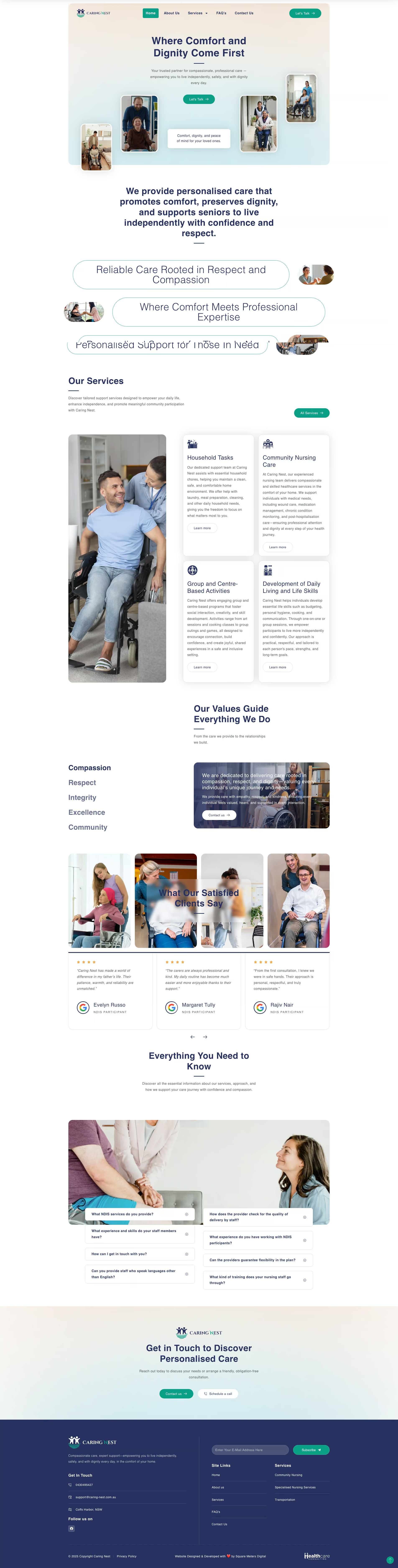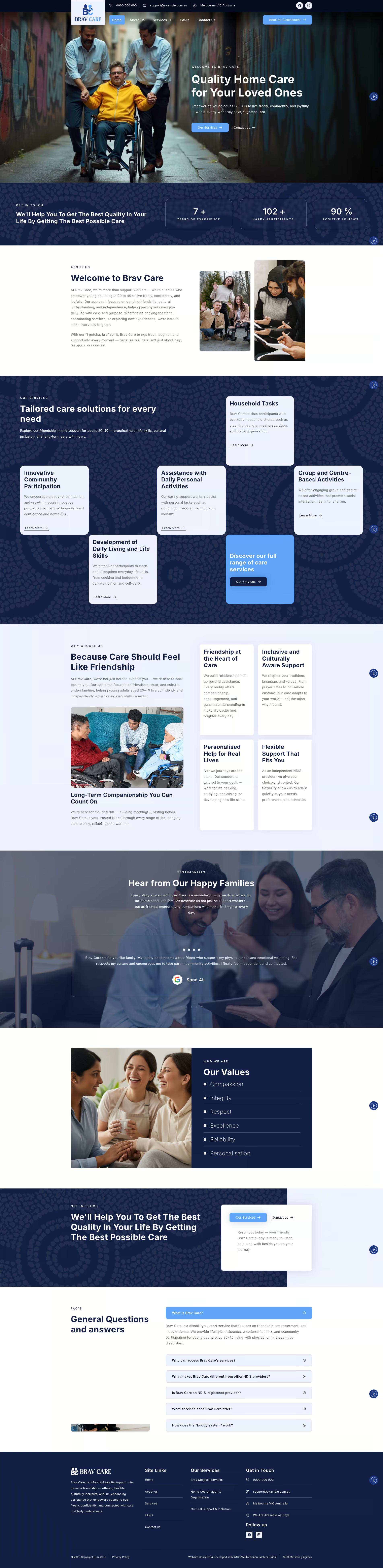


We design your NDIS website around your ideal participant from day one. Once you’ve identified your niche, everything on your website begins from there. From your messaging to your navigation and service pathways align with the types of people you’re best equipped to help. Rather than trying to target everybody, we craft your website around the needs, pain points and goals of your ideal participants. Creating easy layouts that are intuitive to use, increase engagement, and build trust with your target audience immediately.
Search is the foundation of any successful visibility strategy. When your website is built around your ideal participant Your Google becomes razor sharp and defined. We utilise structured content around disability-specific keywords and local SEO terms that your ideal participants and support coordinators are searching for. We also offer seo services that takes your services to the top of Google.
Website reliability is important — NDIS Providers demand it. Security for compliance and speed for their website visitors. That’s why we host all of our websites on secure, high-performing platforms. Compliant security that are built for aged health care and disability support providers. Speed, stability and reliable performance combined with your niche website design creates instant professionalism and trust with new visitors.

Generic websites try to cater to everyone. But effective ndis website is with a clear focus. Converting better because they cater to a specific problem. When your ideal participant lands on your website and immediately feels like you understand their problem. They’re more likely to take action. Whether it’s filling out a contact form or giving you a call. Website pages are designed with specific CTAs, service journeys and tailored messaging that aligns flawlessly with your chosen niche.

There’s no use identifying your niche if the phone calls you receive don’t turn into appointments. In this workshop we walk you through the psychology behind turning enquiries into booked appointments by using empathy, defined scopes and professional communication. You’ll learn how to stop “helping on the spot” and start guiding conversations with your callers. You’ll use industry-tested language that builds trust with your ideal participant from hello.

Ads don’t create sustainable growth — strategic partnerships within your niche do. Nobody wants to refer to a provider they can’t understand or who doesn’t clearly define how they can help. In this workshop, we reveal exactly how you can grow your referral network. With Support Coordinators, Plan Managers and other professionals who work with your ideal participant on a daily basis. Learn what referrers are truly looking for. How to position your services and how to create repeatable systems that allow you to build beneficial relationships. Stop chasing leads and start building a pipeline of participants who are the right fit for your business.
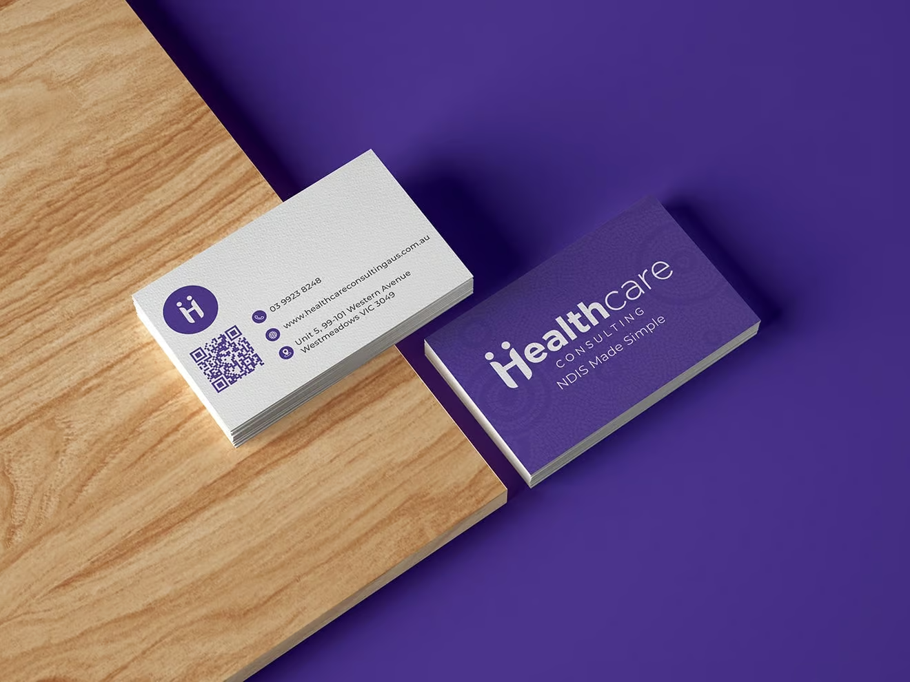
Healthcare Consulting
New You Chiropractic
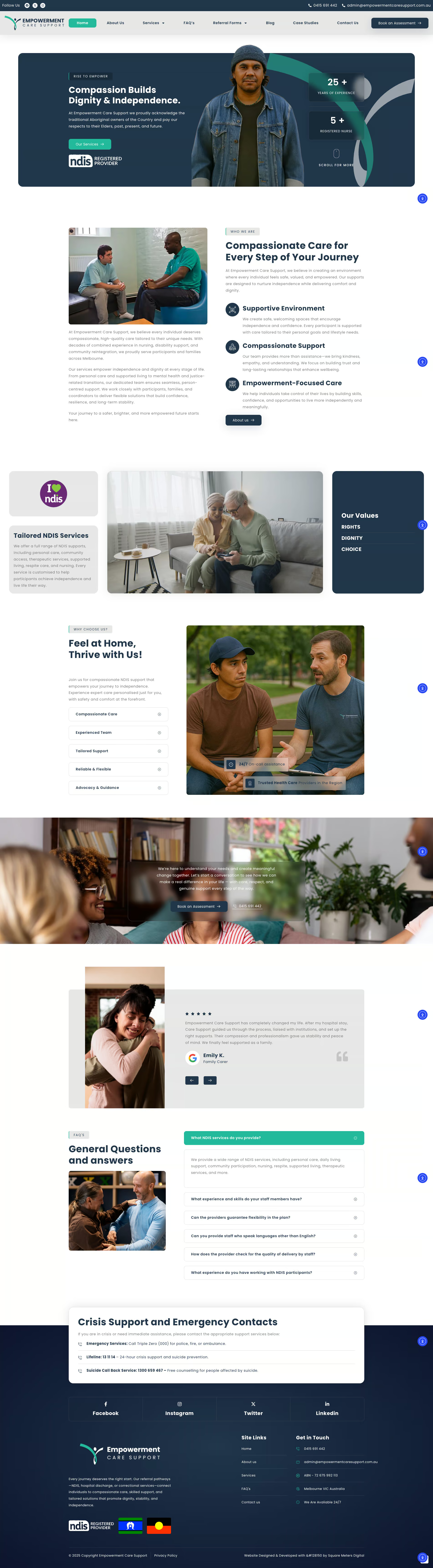
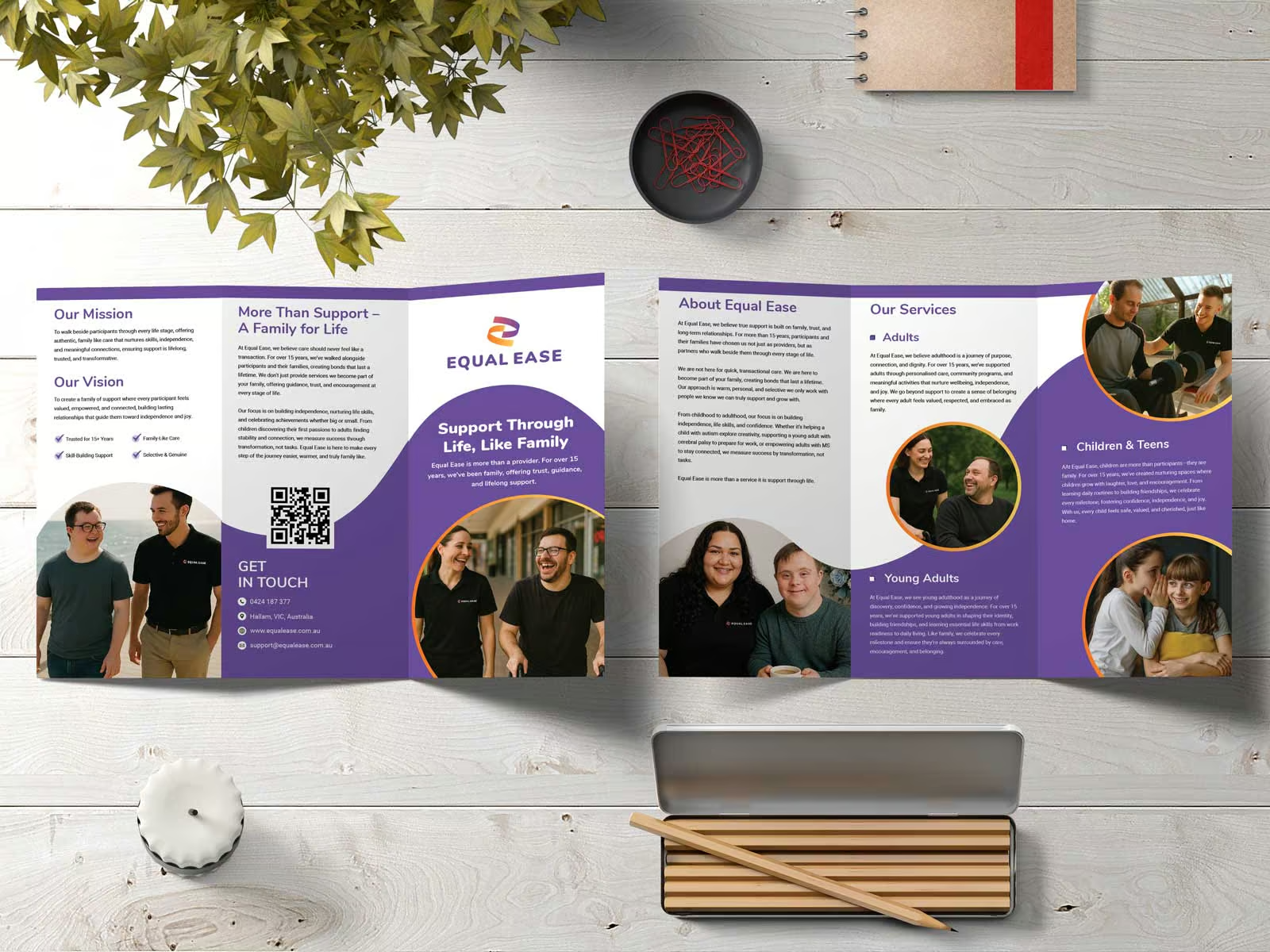
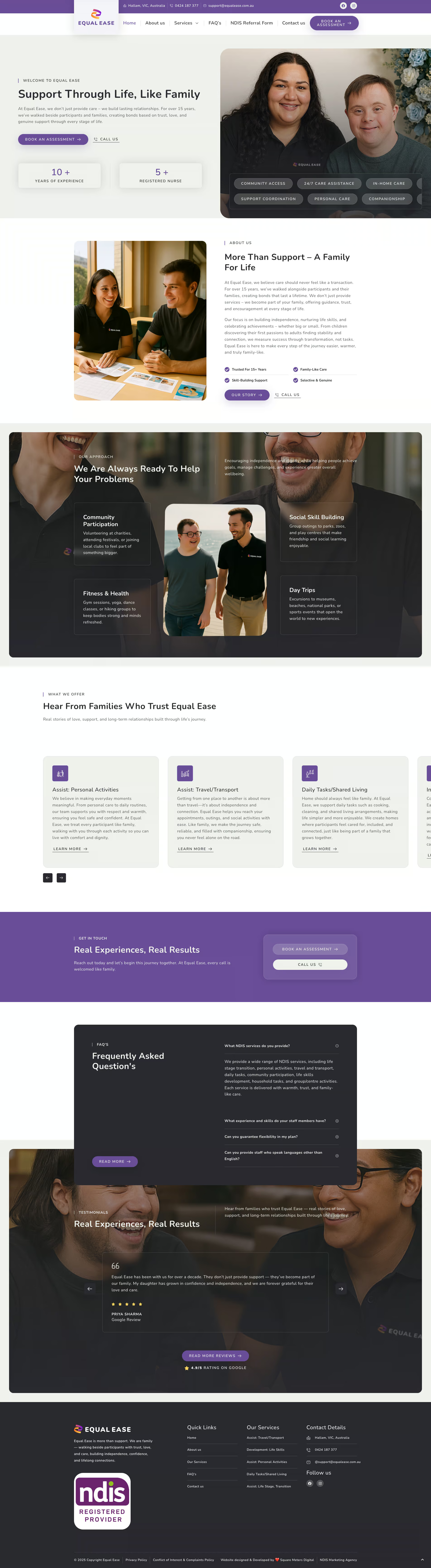
Equal Ease
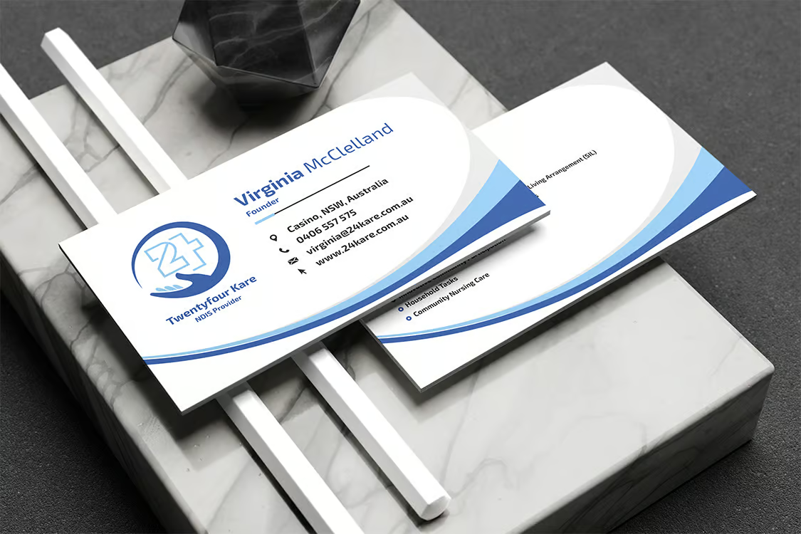
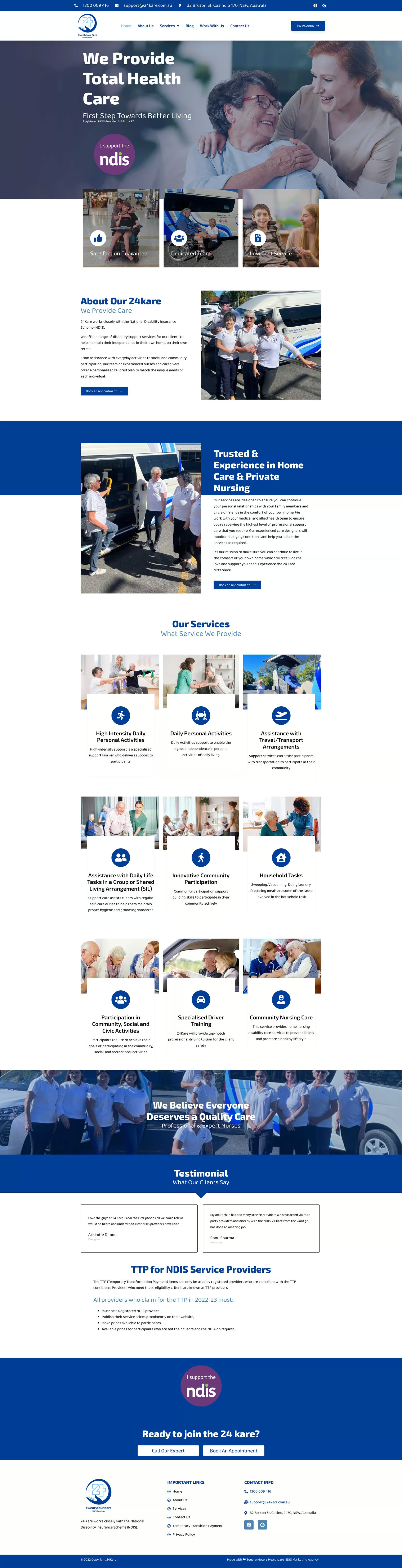
24kare
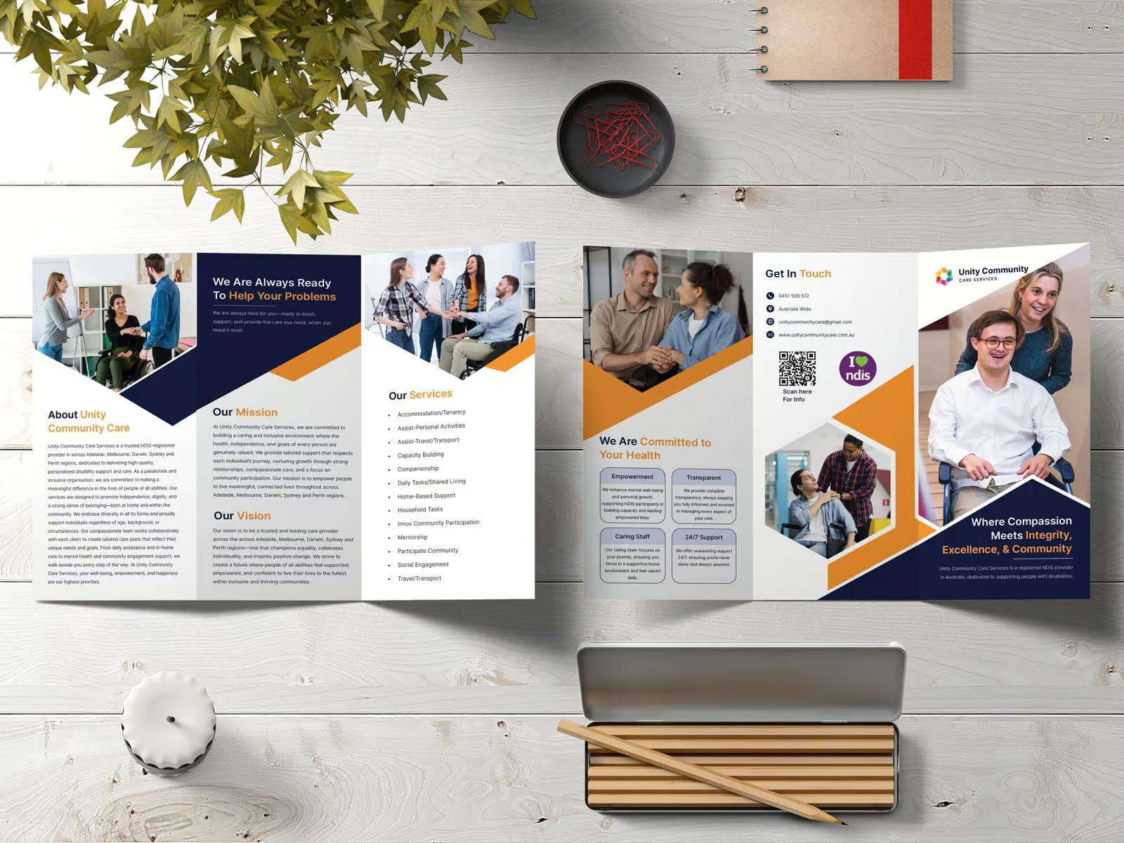
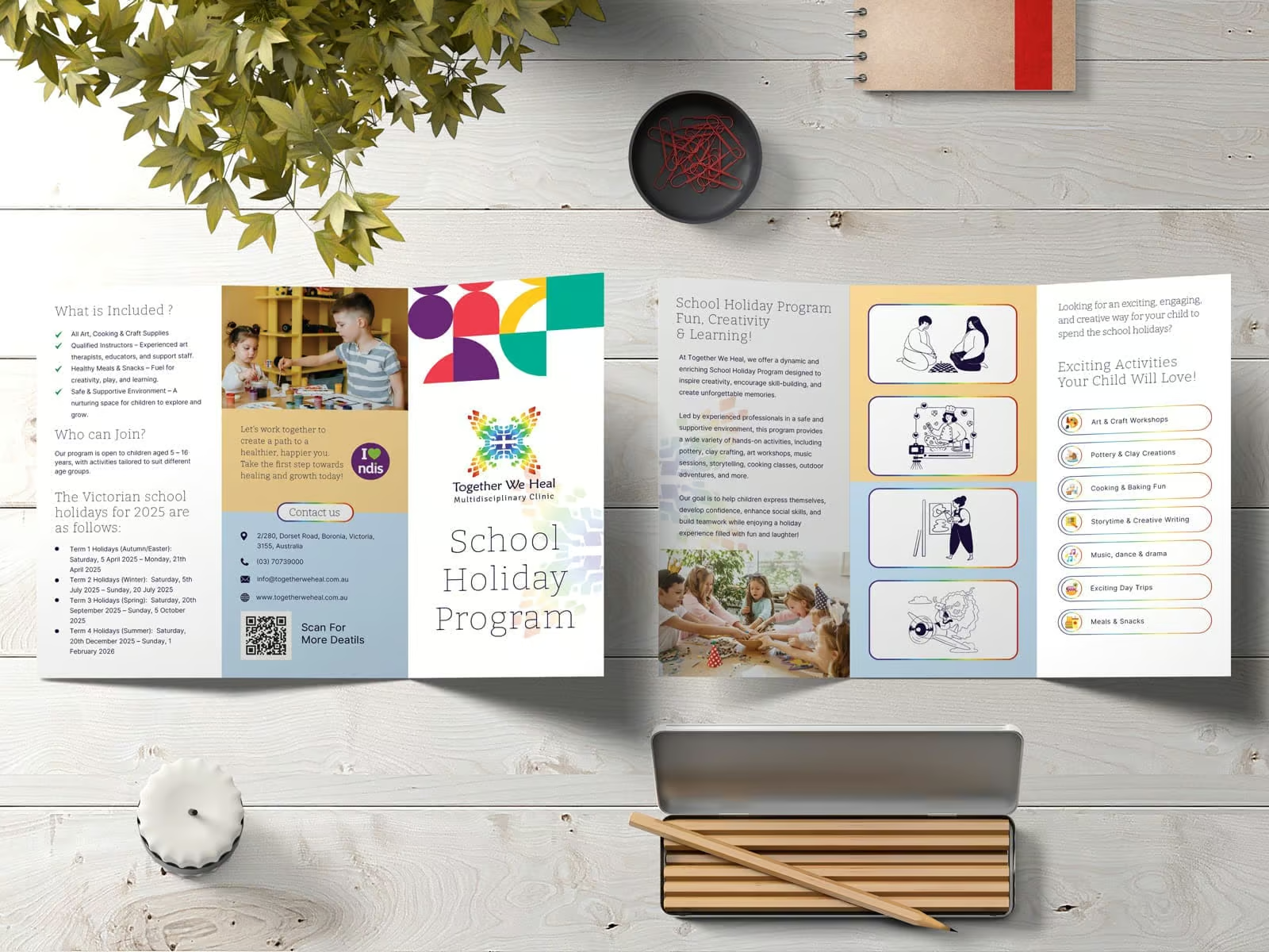
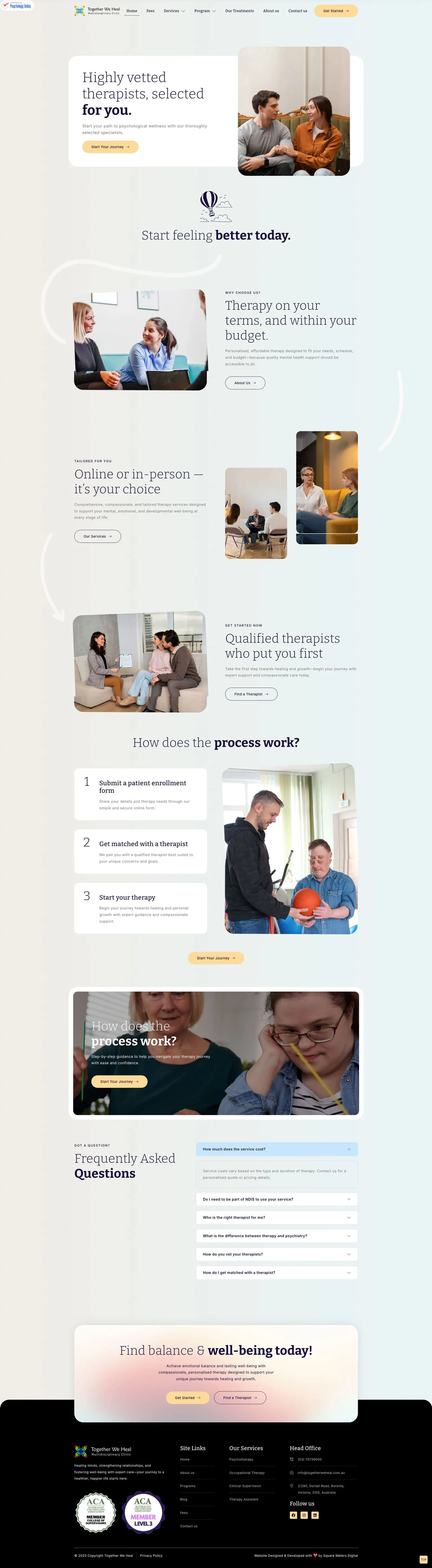
Together we heal
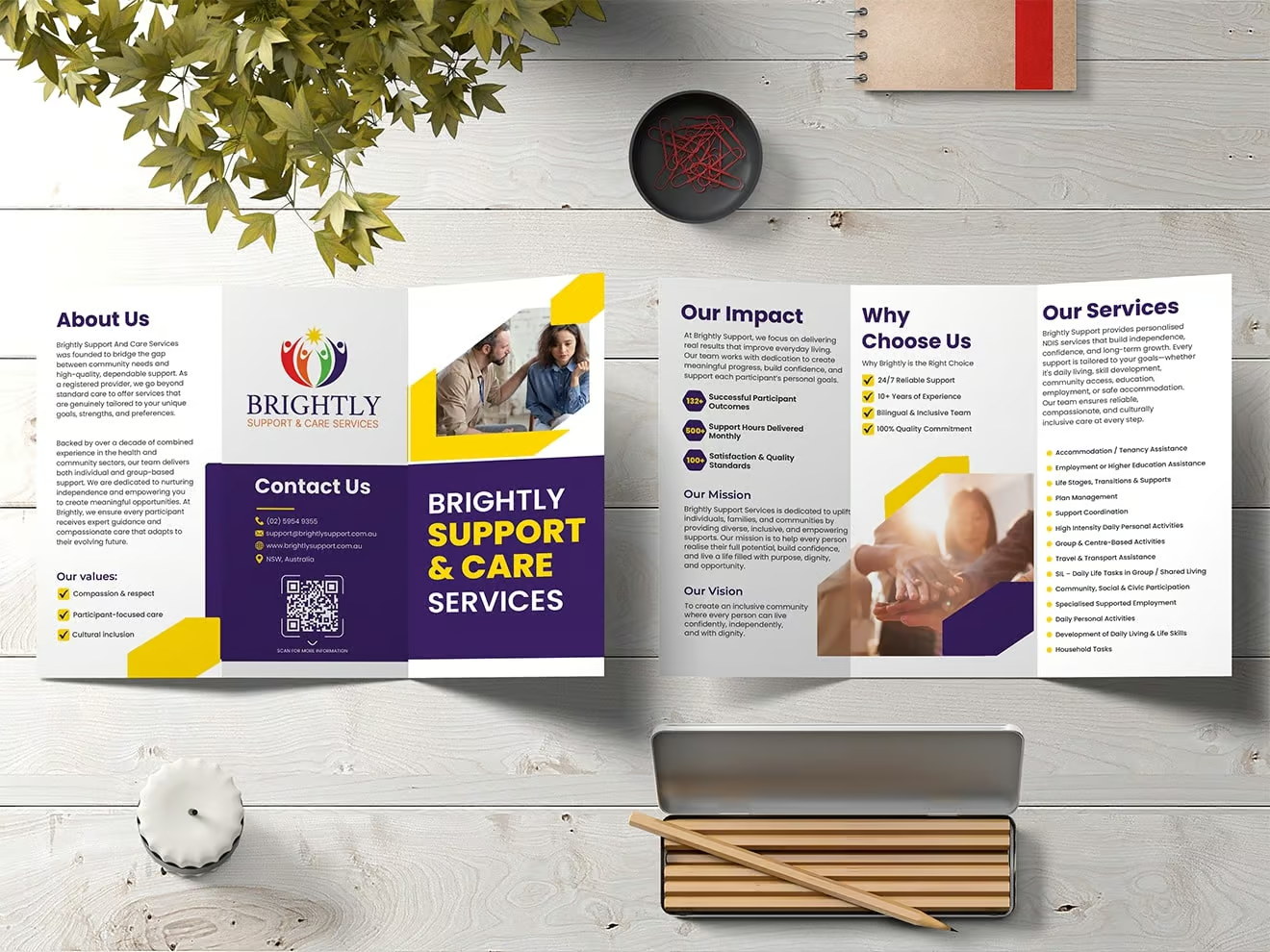
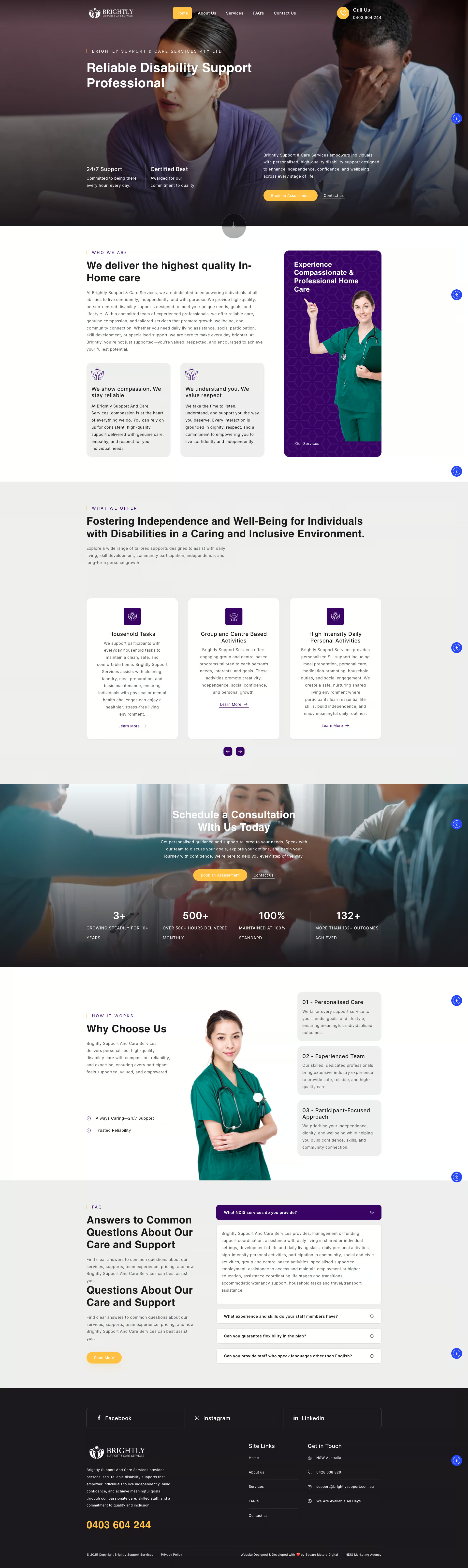
Disability Care Solutions
Avril Shepley