Aurora Care Group
01
We crafted a fresh, contemporary logo inspired by the concept of support, inclusivity, and growth.
- Colour palette: Soft purples and blues to evoke calmness and trust.
- Typography: Clean, legible fonts that communicate accessibility and professionalism.
- Symbolism: The abstract emblem subtly references a guiding hand — a visual metaphor for care and empowerment.
This identity system became the foundation of their entire visual language.
Identity Design
02
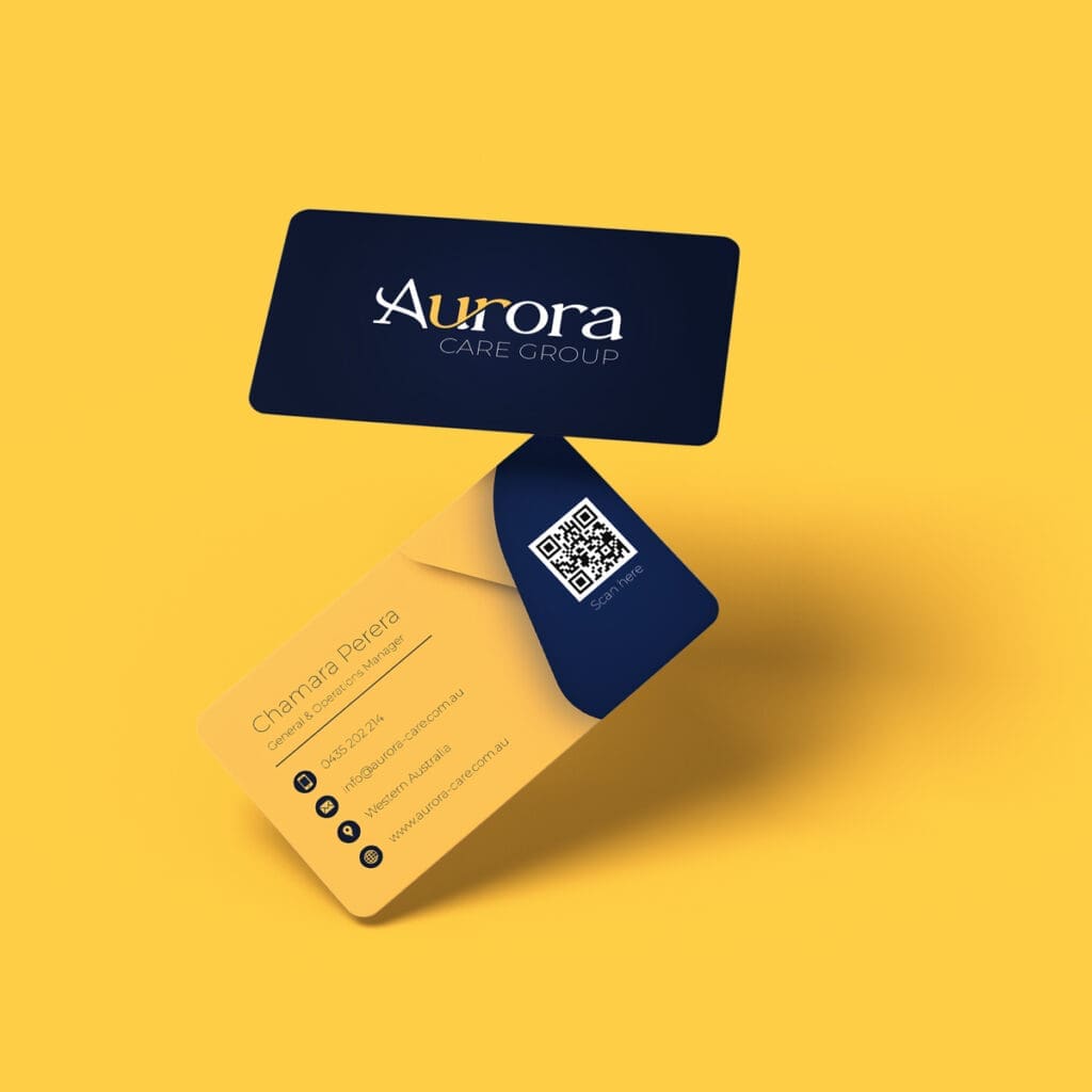
To support Aurora’s outreach and onboarding, we designed a suite of branded materials, including:
- Business cards
- Letterheads and folders
- Informational flyers and brochures
Each piece maintained consistency in tone, colour, and layout, allowing staff to communicate clearly and confidently with participants, families, and partner organisations.
Print Collaterals


03
We developed a fully responsive website that reflects the heart of Aurora Care Group’s work:
- User-friendly navigation for participants, families, and referral partners
- Optimised copy and visuals to convey warmth, clarity, and credibility
- Accessibility-focused design, ensuring compliance with industry standards
- Integration of contact forms and service inquiries for easy engagement
The end result: a digital experience that not only informs, but invites users into a trustworthy care environment.
Website Design

